INCEPTION
Where it all began
The word AIKARO comes from the Maori word KIA ORA which translates, Hello, Welcome, we Embrace you. AIKARO is an organization focusing on Health & Fitness Solutions. The team needs to portray the quality and elegance of their services through their online media, the website should stay aligned to the core concept of AIKARO, Simple, Strategic, and Informative are the major focal points. The AIKARO also caters to a range of Fitness Products and Goodies that are being displayed and sold across their Platform.
CHALLENGE
A Piece of Cake for Creative Minds !
To create a Website targeting an International audience while keeping highlighting the brand value and aesthetics. Simple, Elegant, and Strong Emotions are connected to the design aesthetics.
SOLUTION
Brilliance in Execution
BENEFITS
Focus On a Purpose
RESULTS
Here's the Best Part
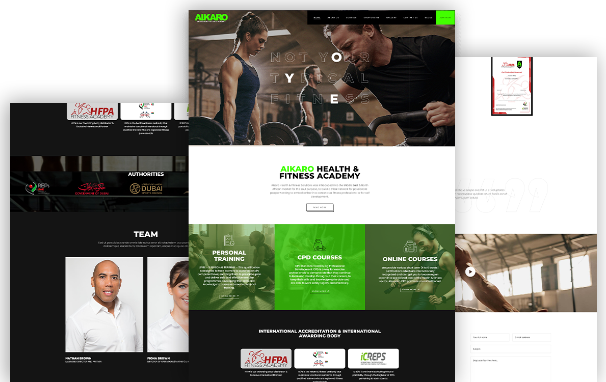
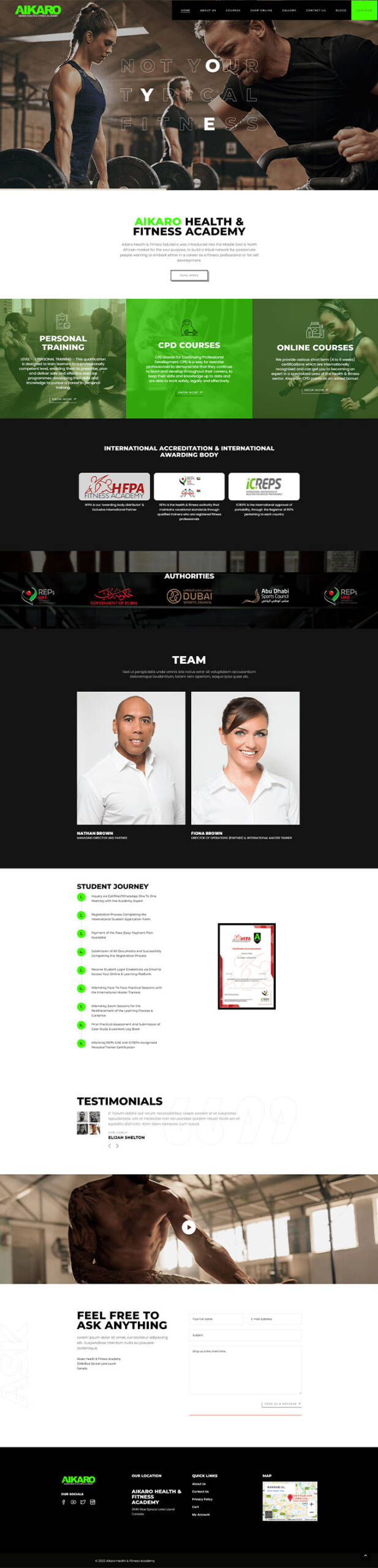
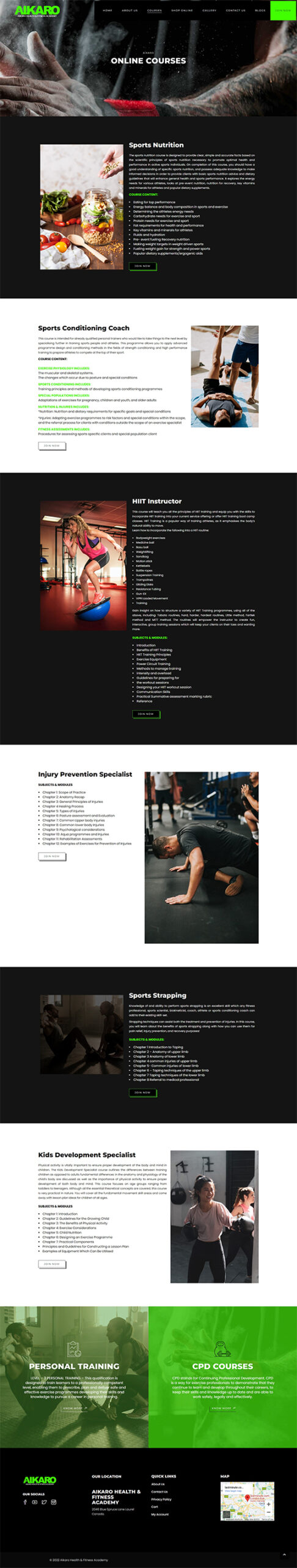
The Final Result IS aligned to the concepts of AIKARO and the Values it projects, The Special Green color used in the logo and the design aesthetics work in the audience’s psychology associated with envy, good luck, generosity, and fertility. It is the traditional color of peace, harmony, comfortable nurturing, support, and well-paced energy.
NEXT
What More ?

